How to QlikView 12X Faster with CoSort
Introduction: As with multiple BI platforms discussed throughout this section of the IRI blog site, this article analyzes the relative data preparation performance (and benefit) of using its external data wrangling engine – via the IRI CoSort product or Voracity platform — with QlikView when ‘big data’ sources are involved.
Business intelligence (BI) platforms enable organizations to collect data from internal systems and external sources, and present it for analysis. QlikView is a popular BI tool that bundles an in-memory back-end analytic engine with an intuitive user interface. Its users can integrate data and visualize the results in the same tool. With demos, training manuals, and tutorials, most users can produce reports before long, though some complain about the menus being less than intuitive.
QlikView can consolidate data from multiple sources, including:
- Access, flat files, and XML documents
- ODBC and OLEDB relational tables
- ERP systems and data warehouses
However, QlikView cannot directly address many legacy or dark data sources, nor the multi-billion- row files or database tables common to high-volume transaction environments. And its internal data integration engine does not scale in volume. Thus, it is in big data acquisition and preparation (data integration) that the IRI CoSort data processing product (or the IRI Voracity data management platform which uses it) provides value to QlikView users.
CoSort can extract and join data from multiple sources and provide it to various targets. Without a DB engine, appliance, or Hadoop, CoSort can franchise (munge, subset, wrangle) or otherwise prepare massive amounts of raw data for downstream applications.
More specifically, CoSort (or the IRI Voracity data management platform that includes it) via its default SortCL program engine — speeds, performs, and combines:
- Data integration (ETL) of big structured, semi-structured, and unstructured data sources
- Legacy data-type, file-format, and database migrations
- Data masking, including encryption, pseudonymization, and redaction
- Reporting, with built-in 2D features, or data franchising for BI tools like QlikView
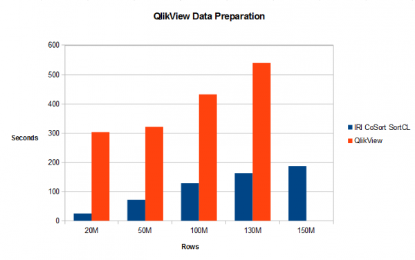
To demonstrate the relative performance of preparing data for QlikView visualizations using both QlikView and CoSort/SortCL, I acquired and processed large CSV files with both systems, and timed their differences. On my 8GB PC, QlikView failed at 150M rows (CoSort did not).
The Bottom Line
The data that both systems made available for QlikView charts was the same, but the time they took to prepare it was anything but. Given 20 million rows of source data, the CoSort SortCL program — tuned to use only half my available RAM (4 of 8GB) — took 25 seconds to produce the charted values, while QlikView required 303 seconds.
CoSort was considerably faster than QlikView whether testing with small or large amounts of data.The chart below shows the sort and aggregation throughput for files with 20 million records (885MB), 50 million records (2.122GB), 100 million records (4.424GB), 130 million records (5.752GB) , and 150 million records (6.637GB). In each case CoSort’s SortCL program performed better than QlikView. At 150 million records, QlikView got an insufficient memory error and could not run the job, while SortCL ran it in 187 seconds — again with only half the available memory aboard — almost twice as fast as QlikView was at 20M records.
Following are the steps I followed in both cases:
Data Preparation in QlikView
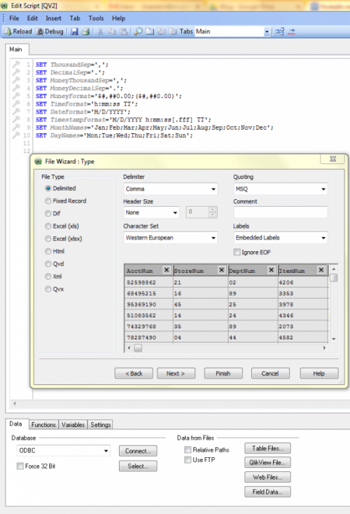
The first step to having QlikView make use of the data source is to load it. The montage below reflects the steps I took, though I could also write 3GL programs that QlikView can use instead:
- Select New from the File menu, and then “Edit Script” from the options
- Click on “Table Files …” button in the bottom pane’s Data tab
- Browse to/specify the input file
- In the File Wizard, select Delimited Select, and click Next or Finish
- Click on the “Reload” tab from the top menu to load the data into the dashboard
The next steps processed my sales data in the way I needed for visualizing it; i.e., sorted and aggregated price values:
- Right Click on the dashboard and select “New Sheet Object”
- Select “Chart” from the menu, and select a “Table Object”
- In the table object which shows the first rows of the input data, click on the DeptNum column to establish the sort order
- Repeat the above steps to build a subset table with only the DeptNum and Price columns, which will be the basis for our visualization
- Repeat the initial steps to create a new table object containing only the Price column, in order to summarize those values
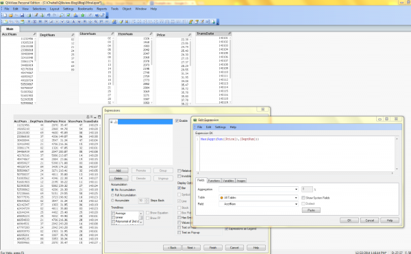
- Click Next, and select the option to insert an aggregation formula. Specifying the expression: Max(Aggr(Sum([Price]),[DeptNum])) calculates the total sales volume (via the Price column) for all the items in each DeptNum.
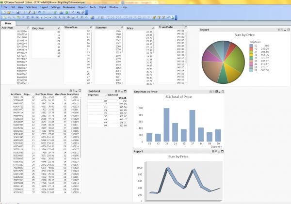
The sorted and aggregated results are shown in the smaller, two-column table below, along with the Pie, Bar, and 3D chart representations of that data which I developed using chart objects:
Data Preparation in CoSort
To sort and sum the same data in CoSort, I need a simple SortCL job script. I can either write it by hand, or use the new sort job wizard in the free IRI Workbench GUI. IRI Workbench is an integrated development environment (IDE) built on Eclipse™ to create, run, and manage data connections, metadata, and job scripts.
Learning the language is simple enough, and I can write and modify the scripts in the GUI’s syntax-aware editor. But for those finding any 4GL scripting objectionable, the GUI can also build them automatically with an end-to-end job wizard or a visual ETL workflow (palette).
In addition to being easier to learn and use than the 11 QlikView steps above, I have saved metadata and job templates that I can re-use, extend, and share, plus centrally-accessible data results for use in multiple visualization and applications.
From CoSort Into QlikView
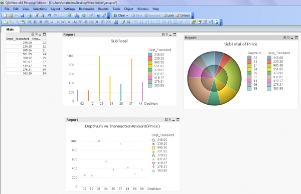
The file CoSort’s SortCL program produced can be imported into QlikView as a table object, and visualized with the same chart options described above using the same formula (which essentially re-summarizes that which we already summarized). I chose to bypass the superfluous formula, however, and use the QuickChart wizard to produce like graphs from the same (CoSorted) data:
To go the QuickChart route:
- Load the CoSort (CSV file output) results into the QlikView dashboard using the first 5 steps shown above
- From the top toolbar, click on the Chart icon. This brings up the Quick Chart Wizard; click Next
- Select a chart type and click Next.
- Select First Dimension (DeptNum) and Second Dimension (Price) and click Next.
- In the Define Expression dialog, bypass the options and click Finish.
- Repeat steps 3-5 above to add additional chart views
See this section of the web site for more information on data preparation for BI (tool acceleration). If you need help implementing CoSort in QlikView environments, contact IRI support.




1 COMMENT
[…] externen Datenaufbereitung, sowohl in Bezug auf das Jobdesign als auch auf die Laufzeitperformance. Dieser Benchmark zeigt eine 12-fache Zeitverbesserung bei der Anzeige durch CoSort um Daten vor (und außerhalb) von QlikView zu […]